When Graphic Design meets Travel Content
An ongoing personal journey of self-learning graphic design while exploring which formats work on social media to achieve promoting my travel business more efficiently.
Art Direction · Graphic Design · Digital Collaging · Social MediaThe Brief & Challenge:
The goal was to establish a recognizable, cohesive visual language for a new travel agency brand on social media. The main challenge was balancing playful, high-energy aesthetics with clear, informative communication—creating content that immediately evokes the feeling of a glamorous coastal getaway while remaining approachable and engaging.
The Visual Pivot:
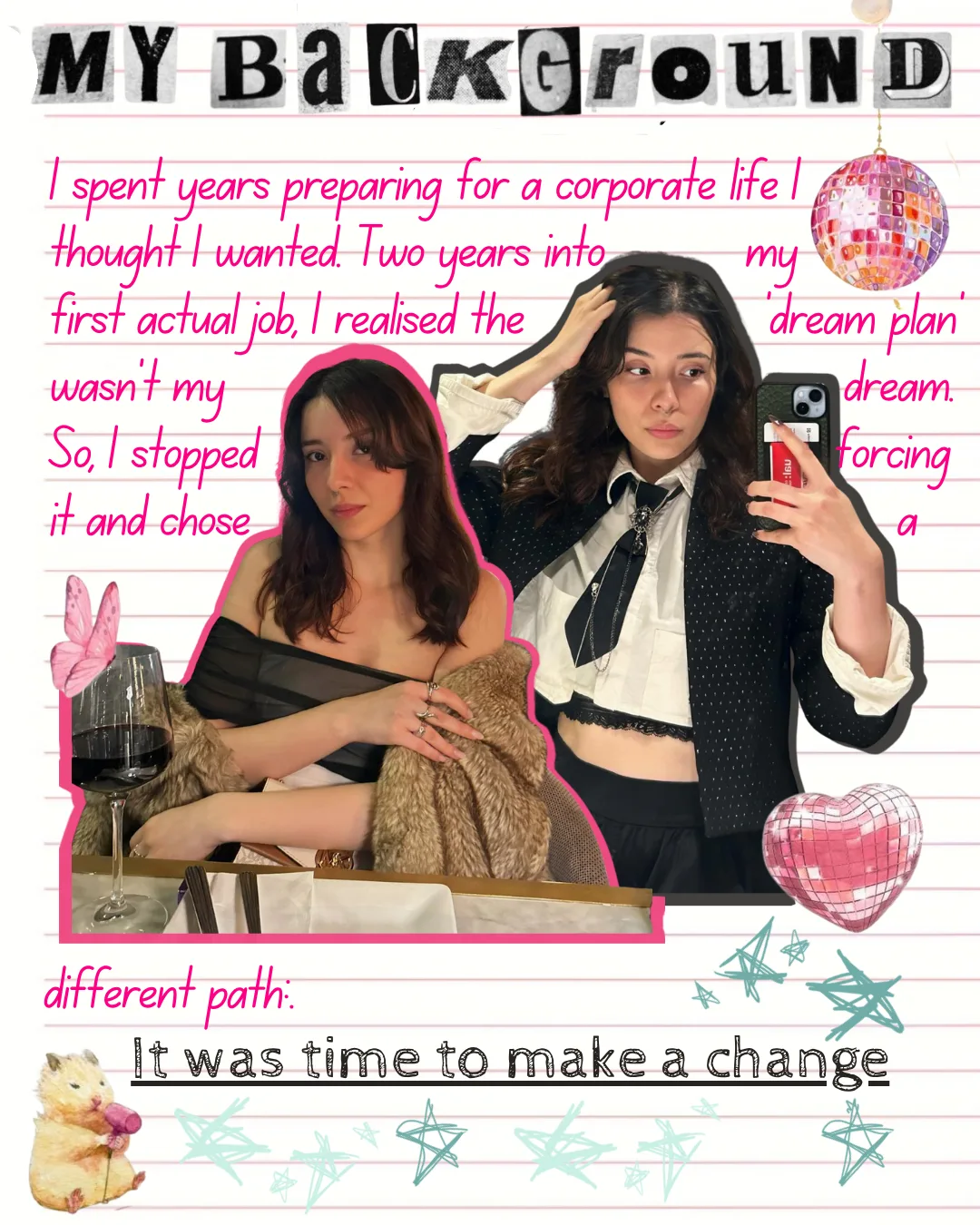
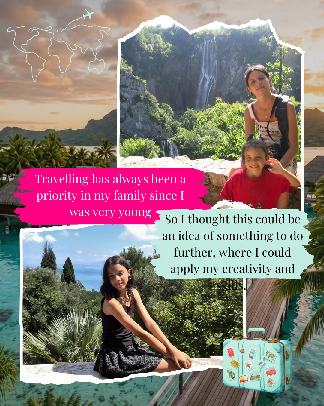
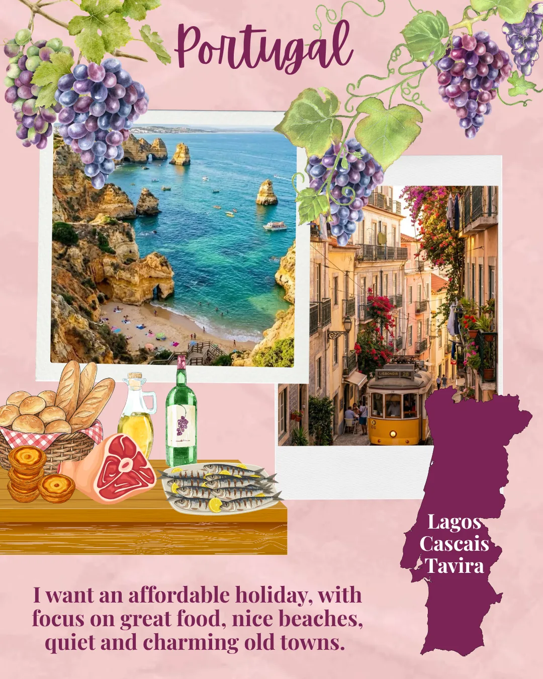
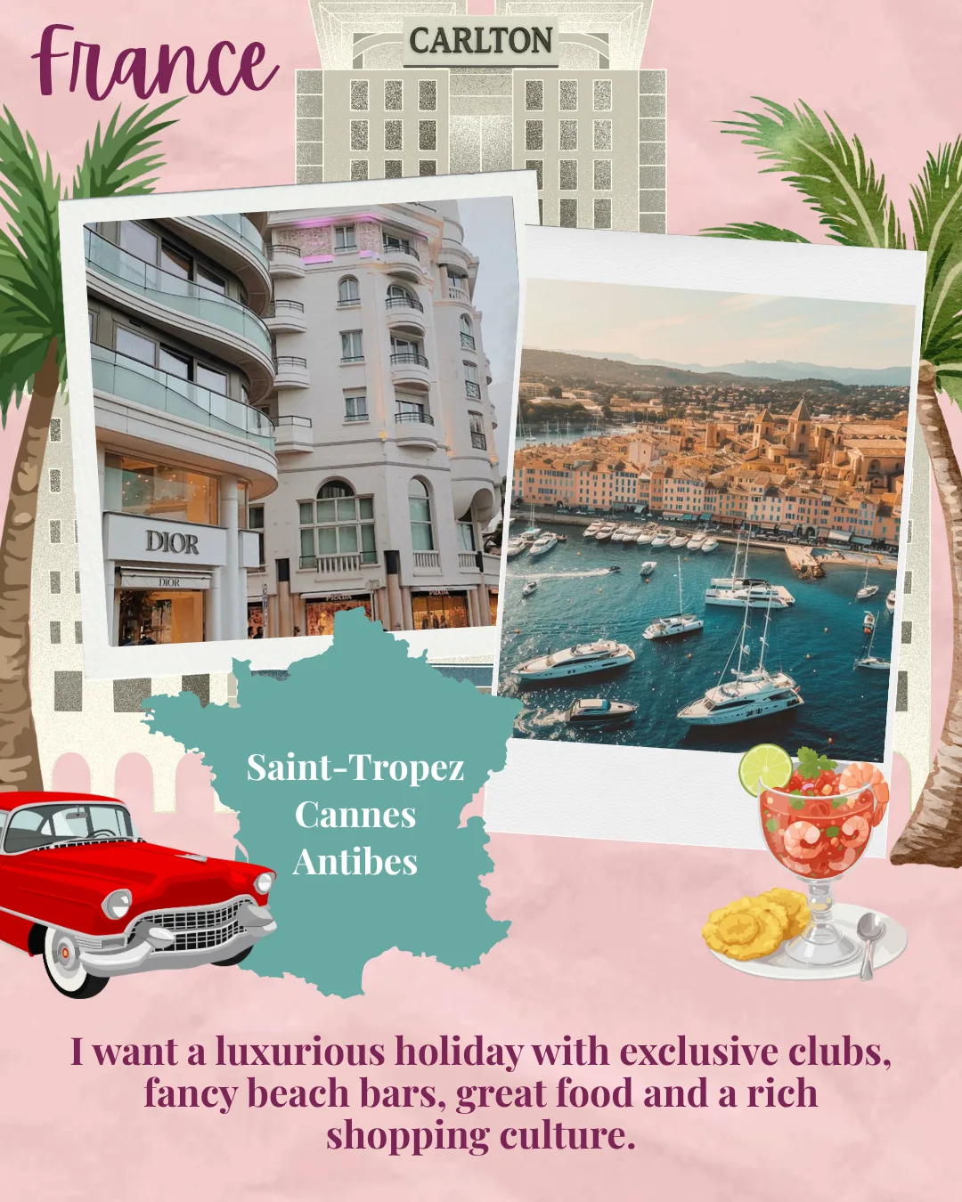
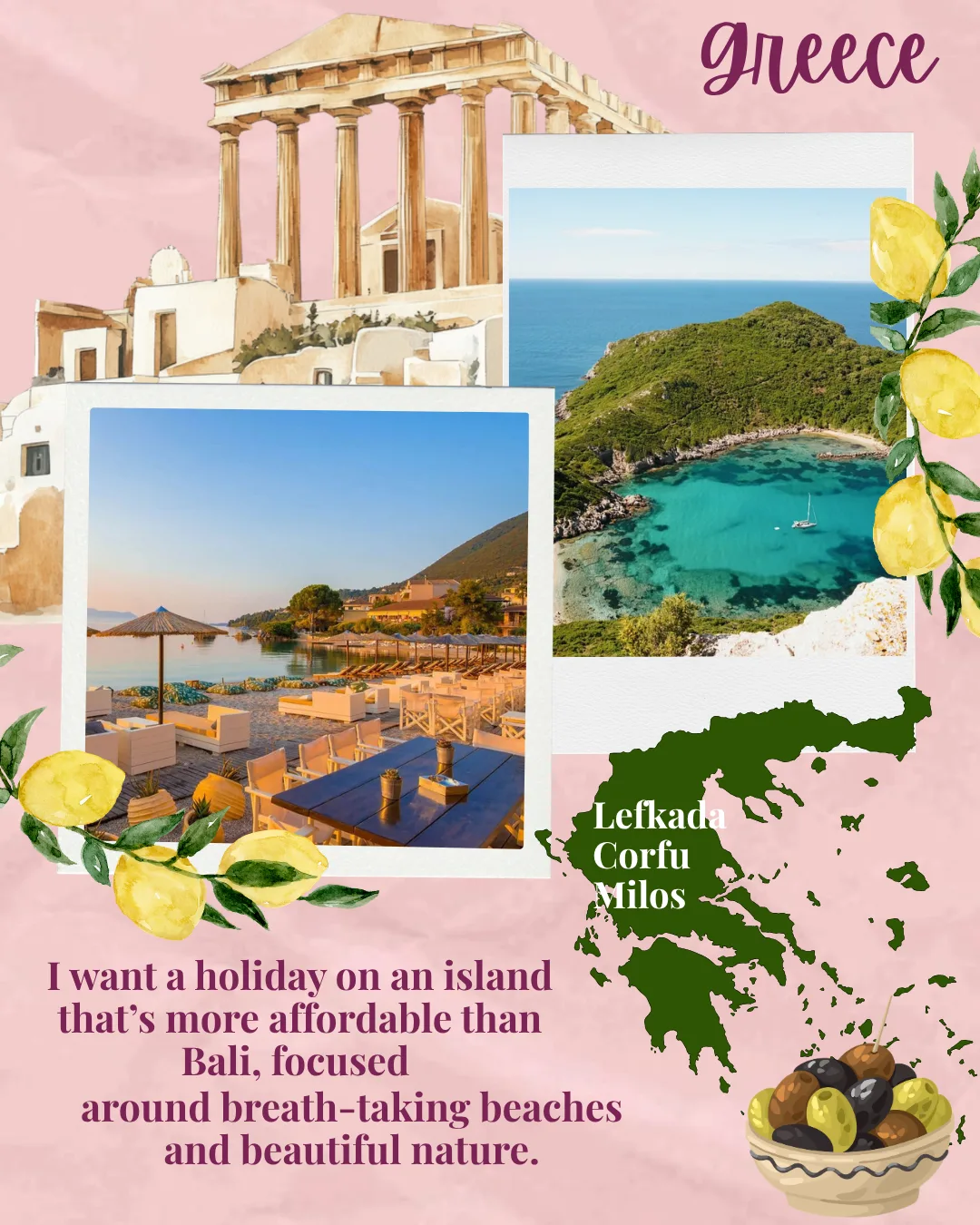
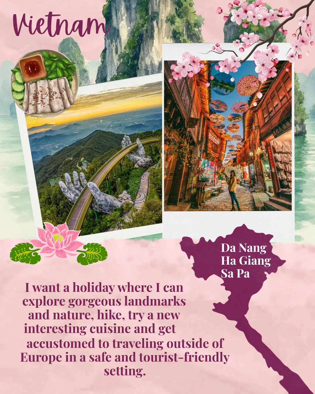
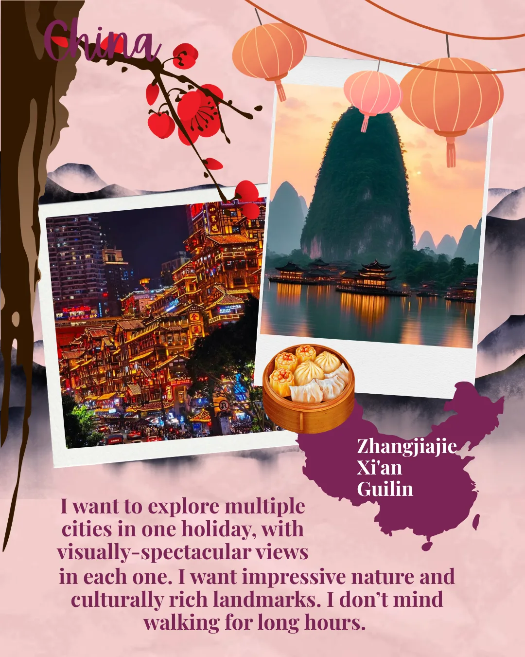
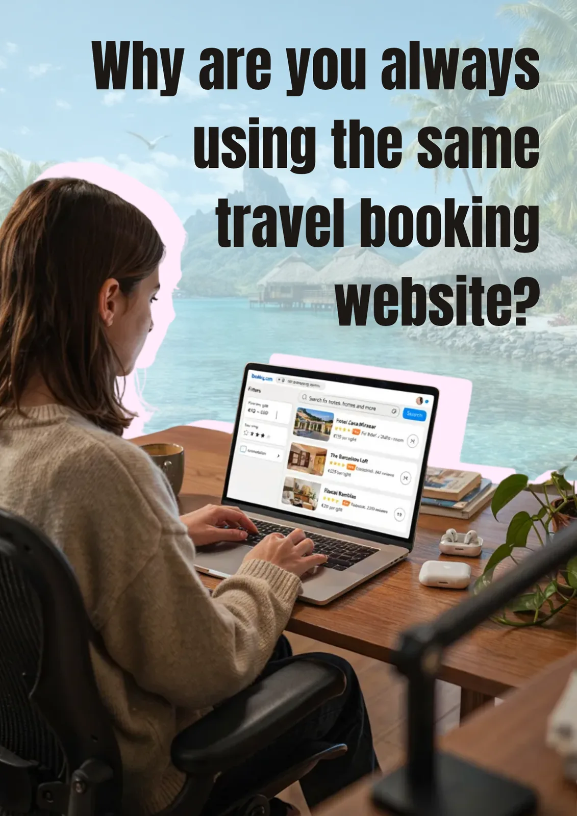
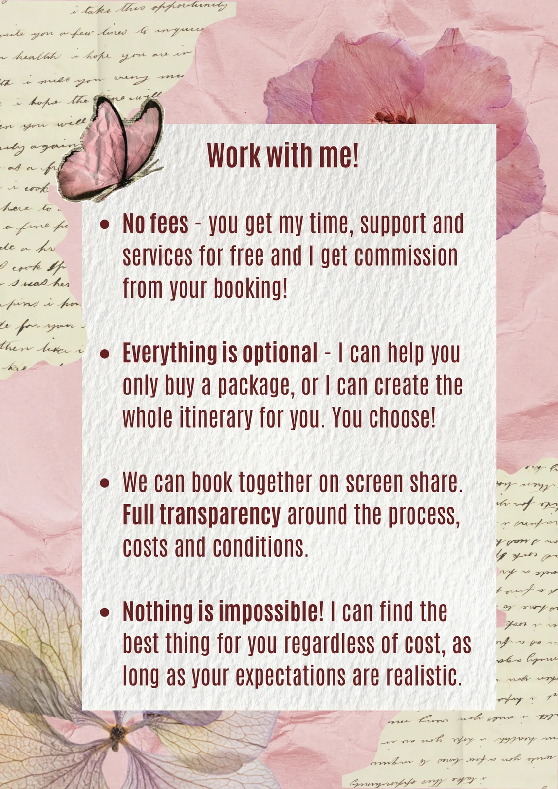
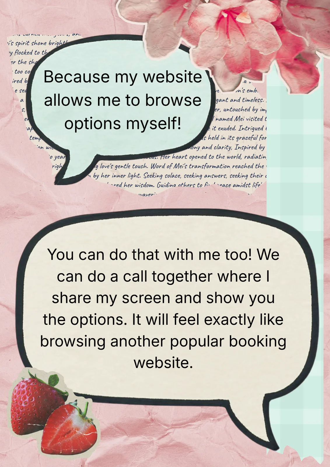
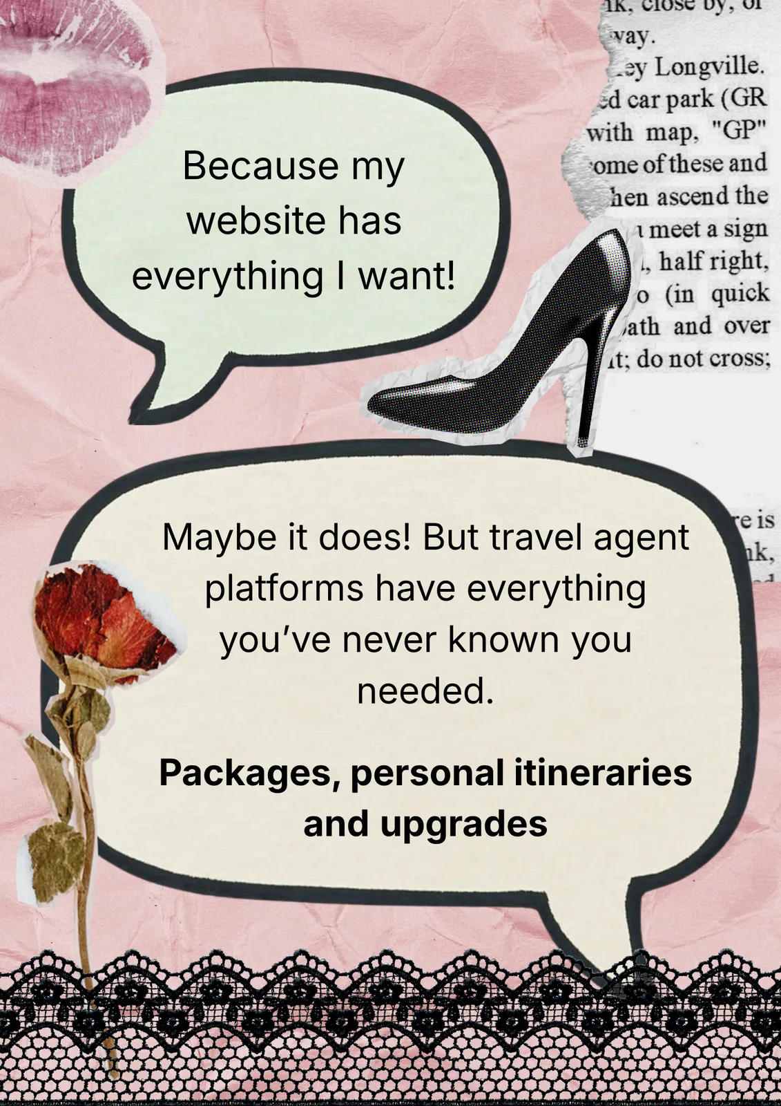
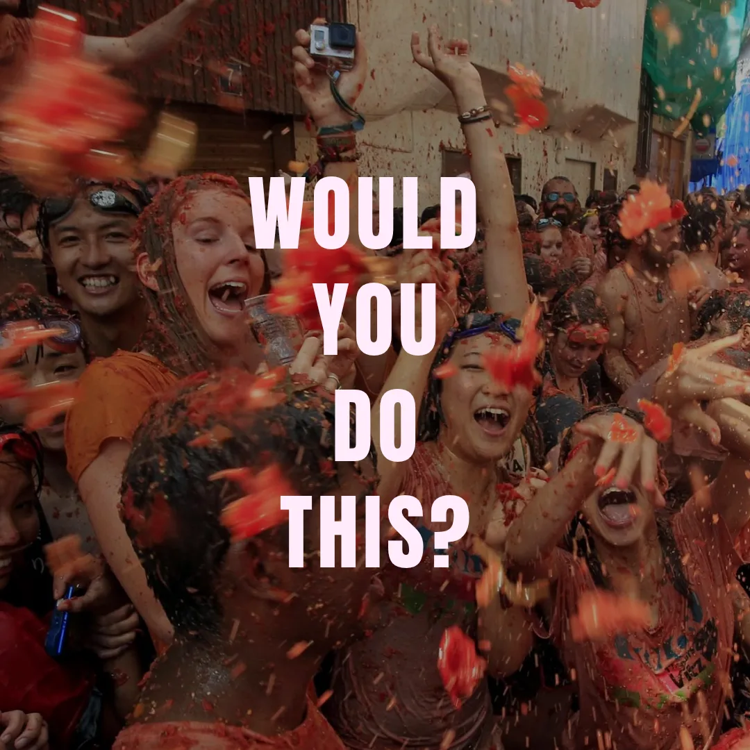
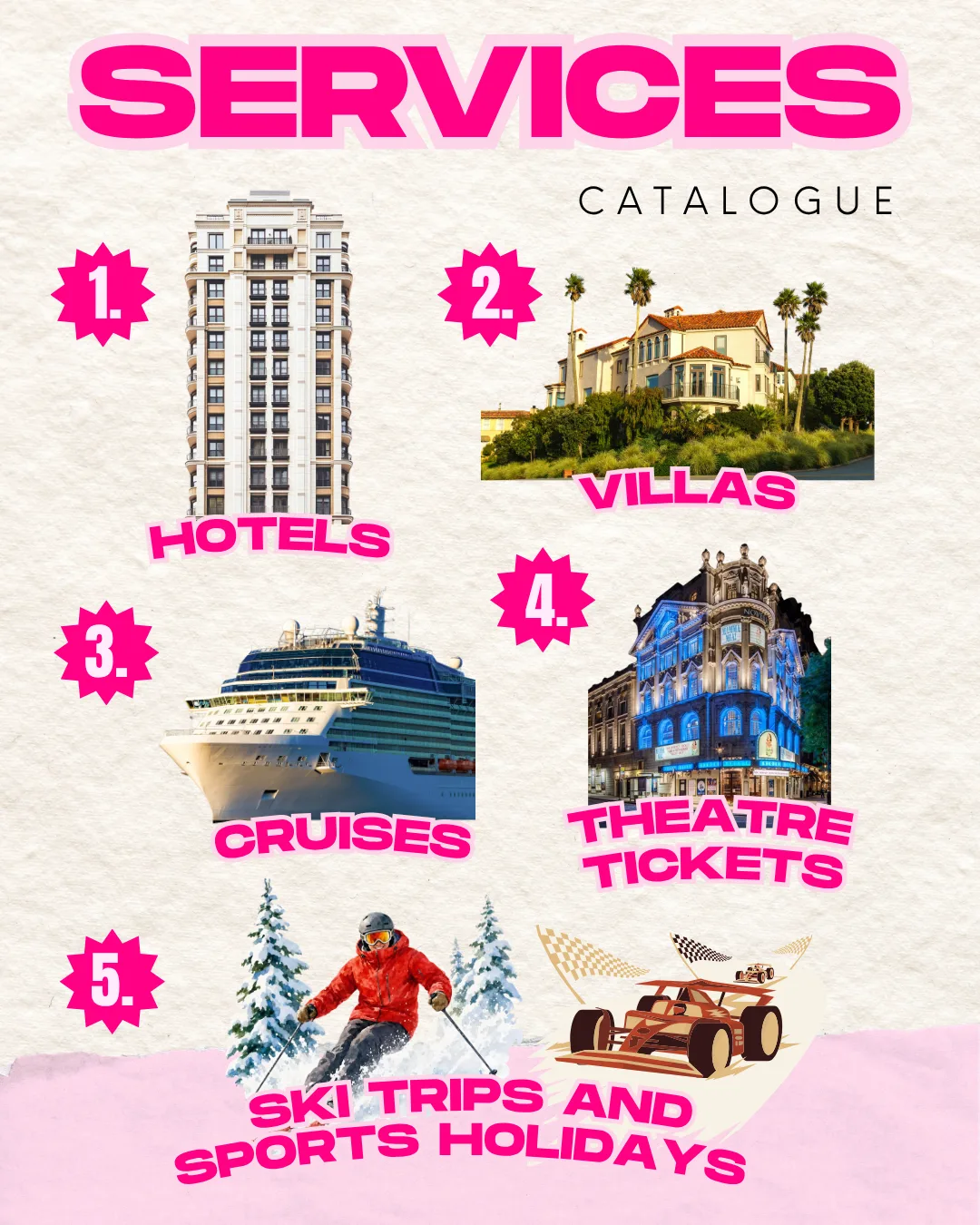
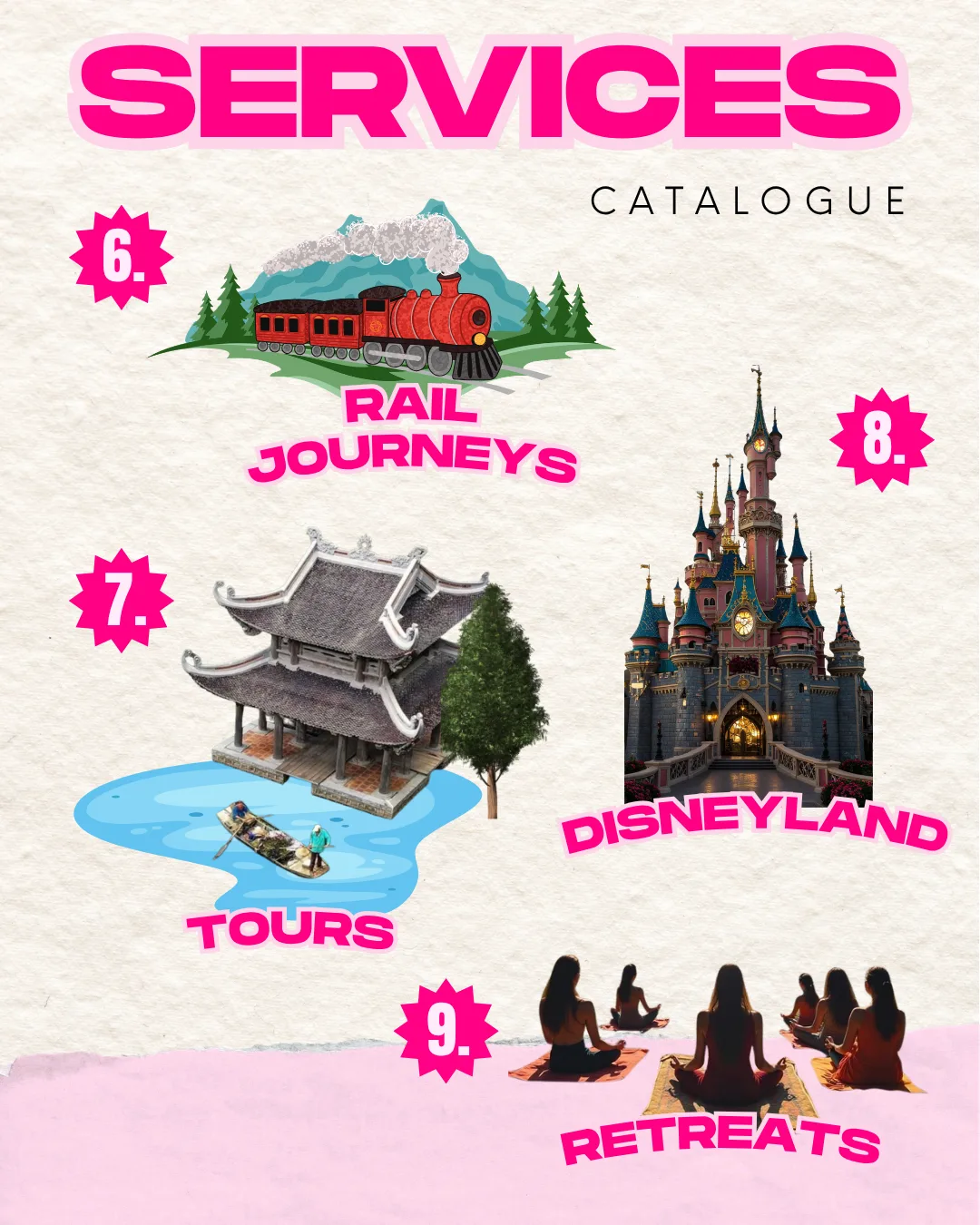
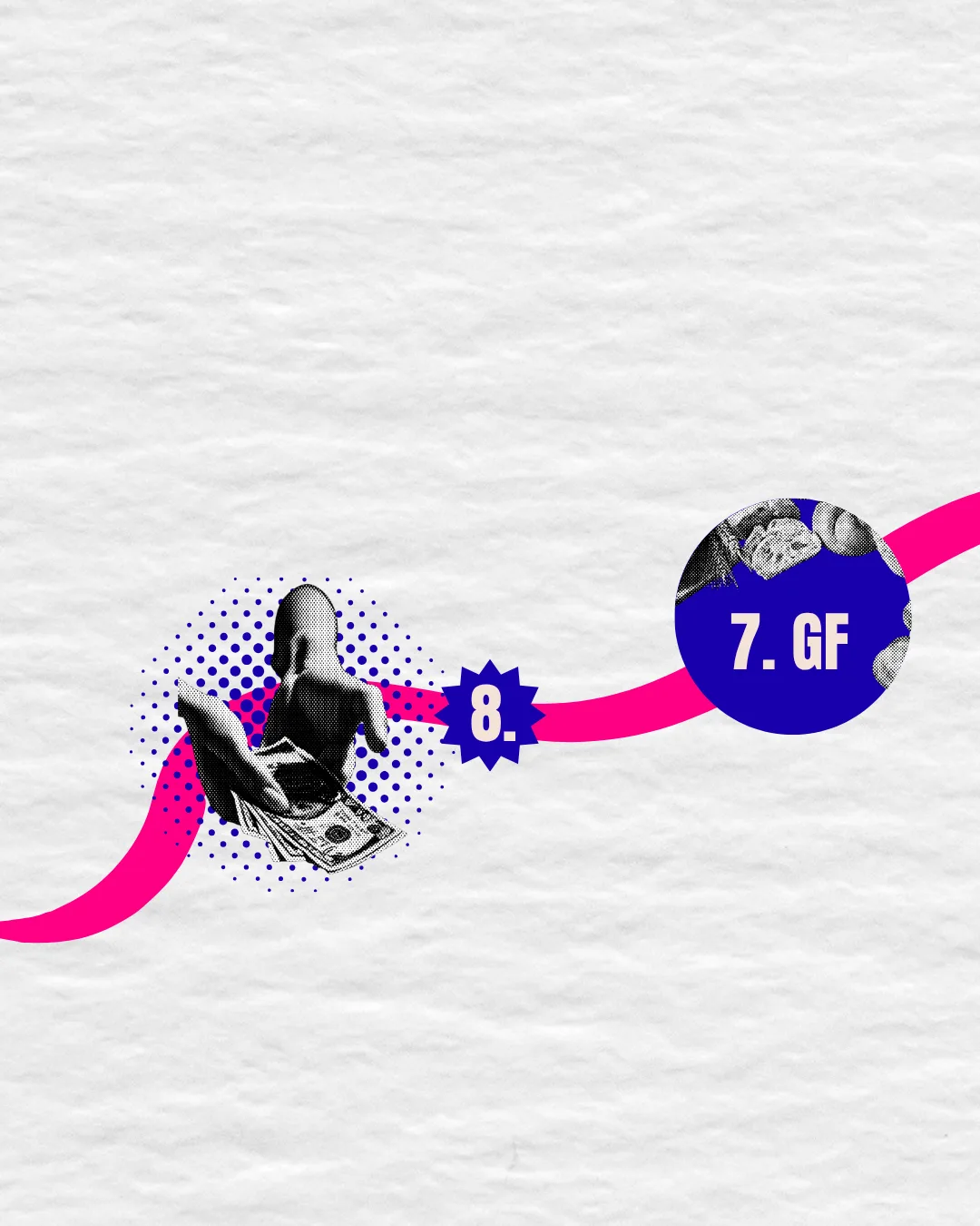
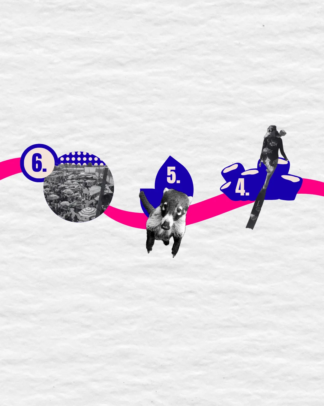
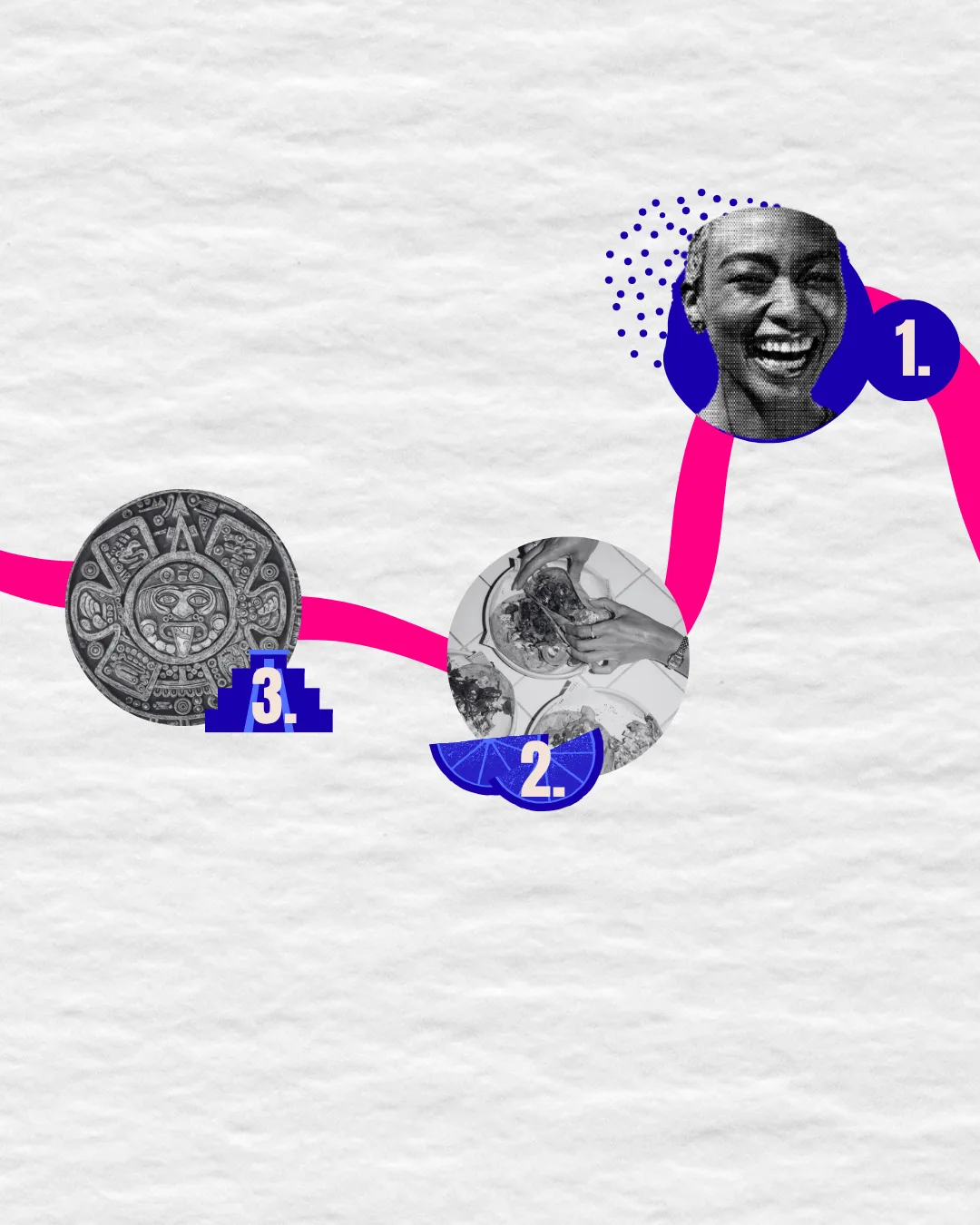
Scrapbook & Narrative Design Starting with a vibrant color palette of hot pinks, light pinks, and baby blues, the visual direction evolved from standard social media templates into dynamic, collage-style storytelling.
Exploration:
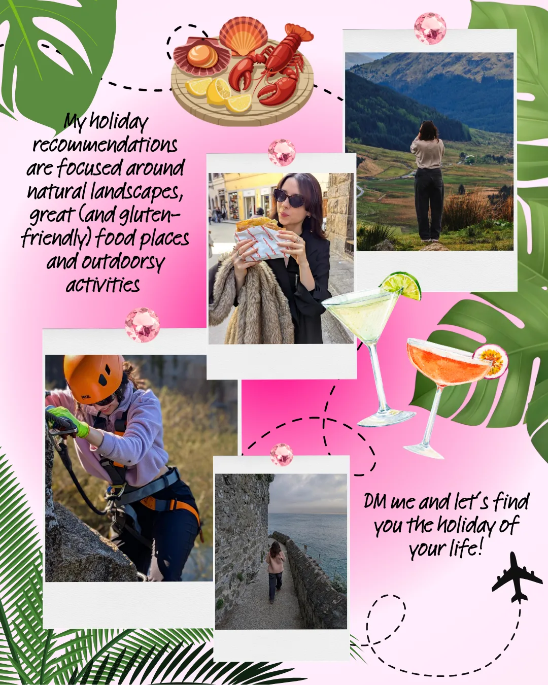
Leveraging Canva to build custom layered layouts, the strategy incorporated a whimsical "scrapbook" aesthetic to deliver travel recommendations without overwhelming the viewer.
Refining Tone for Sensitive Topics:
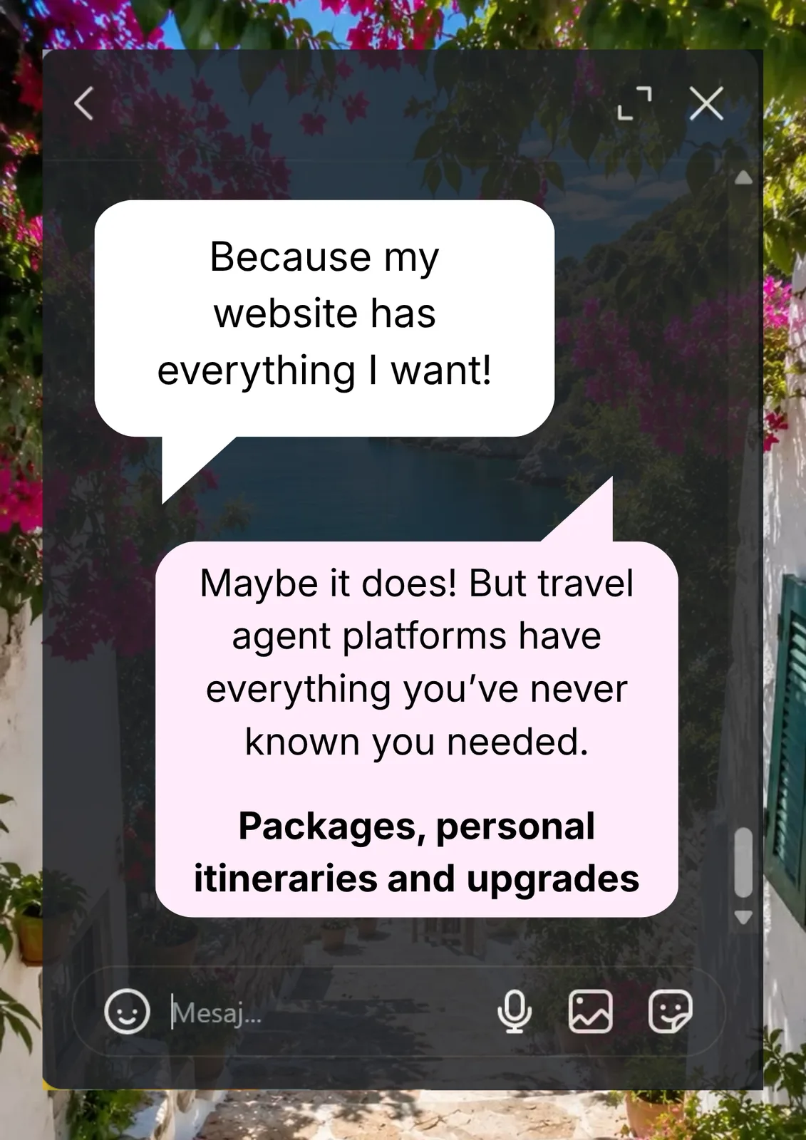
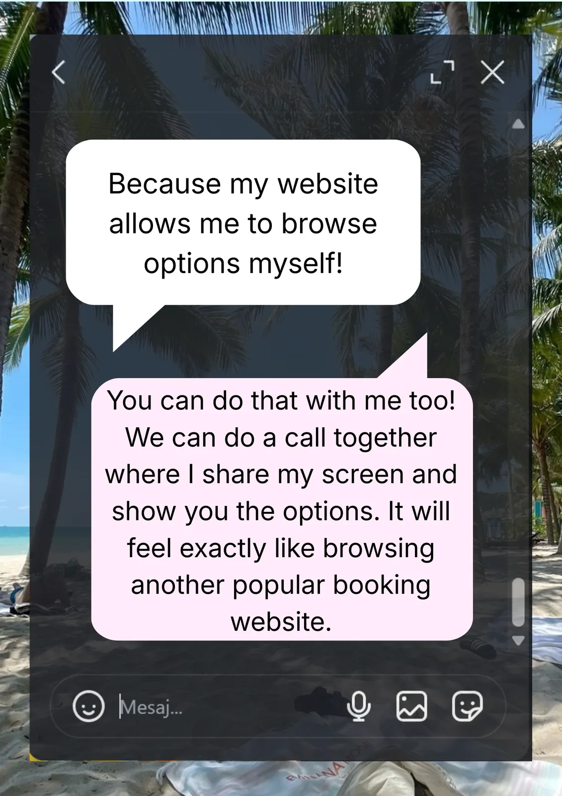
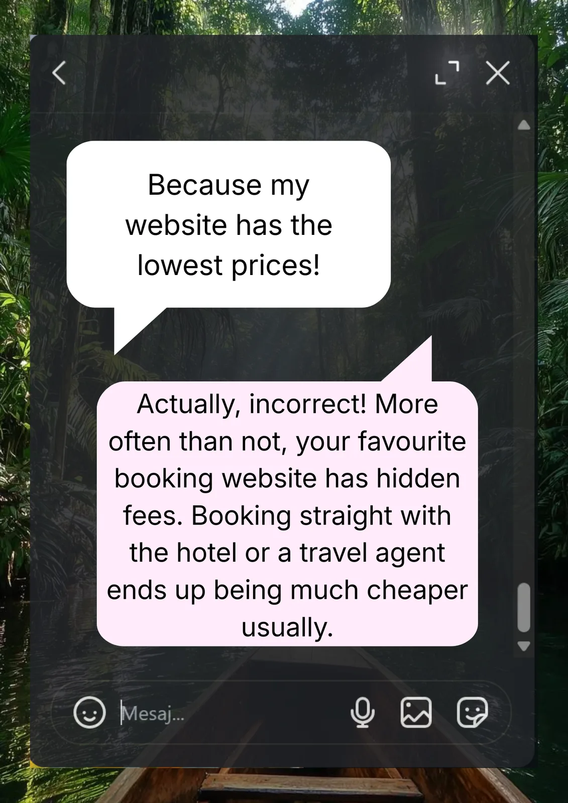
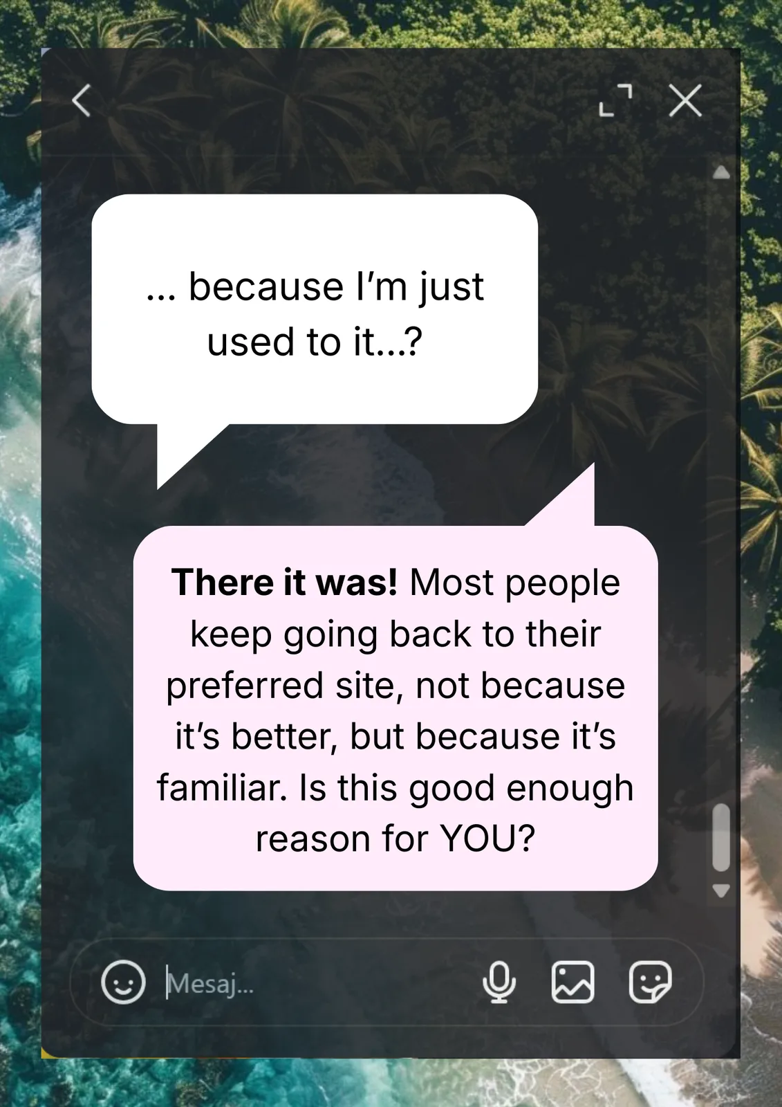
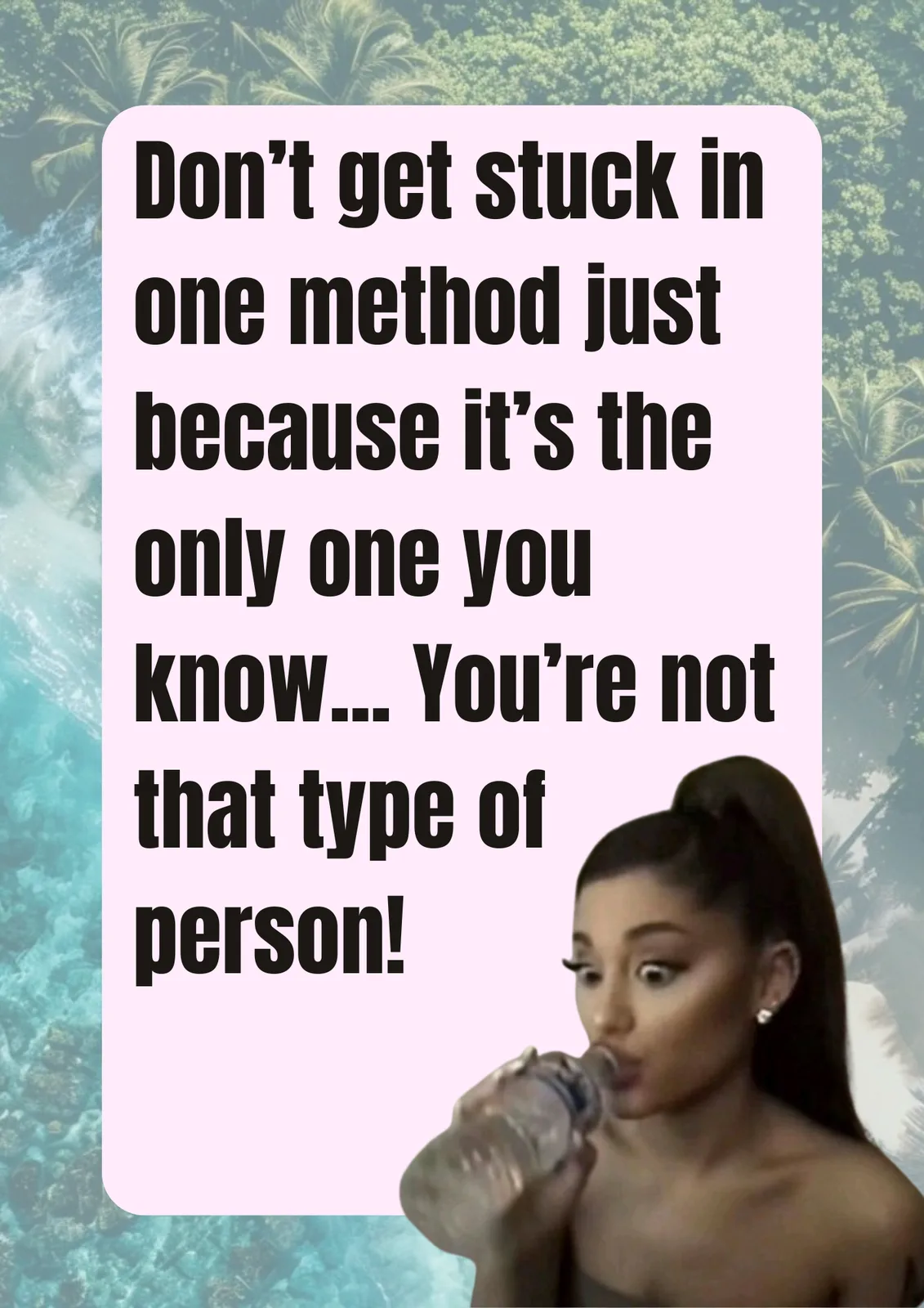
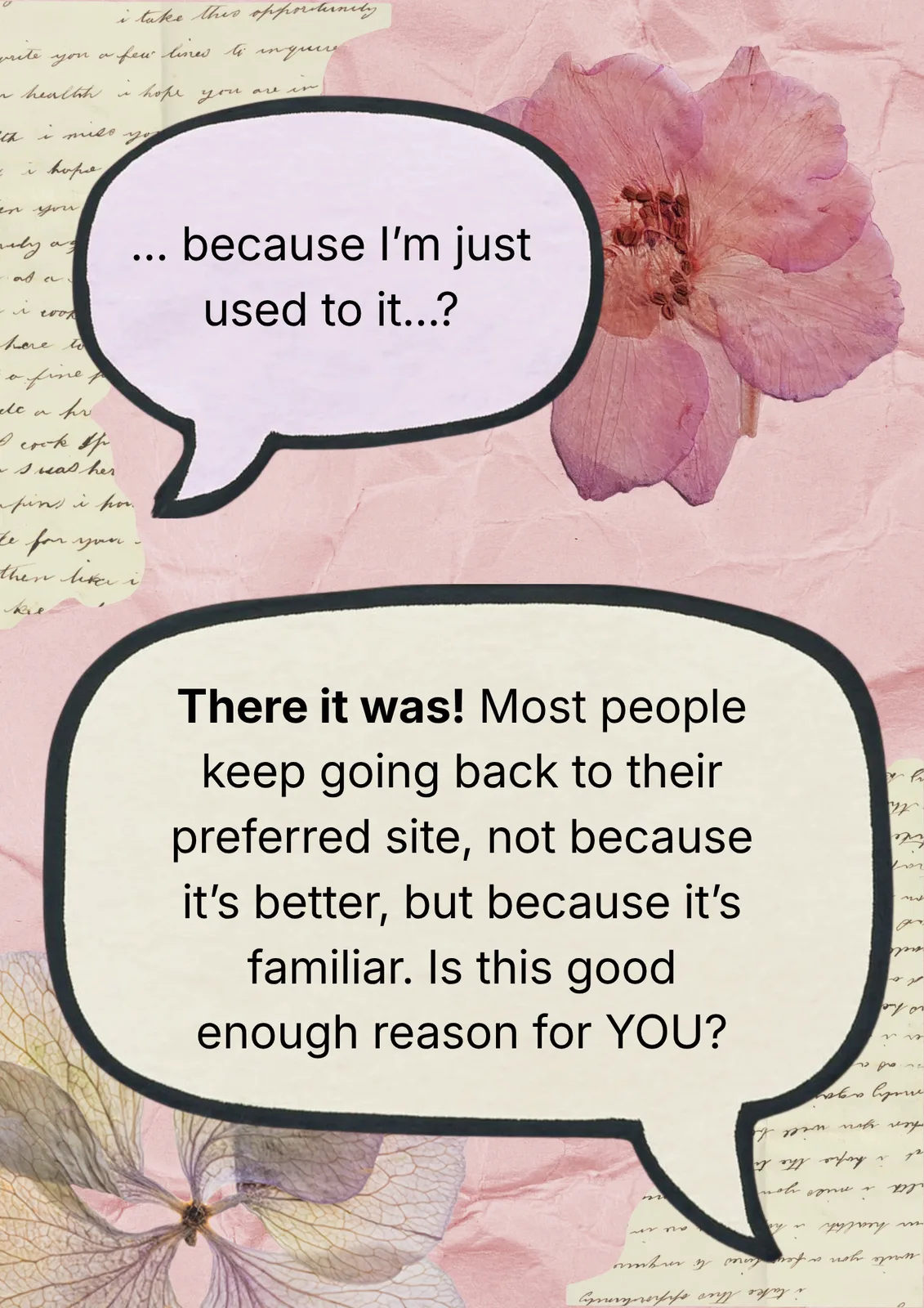
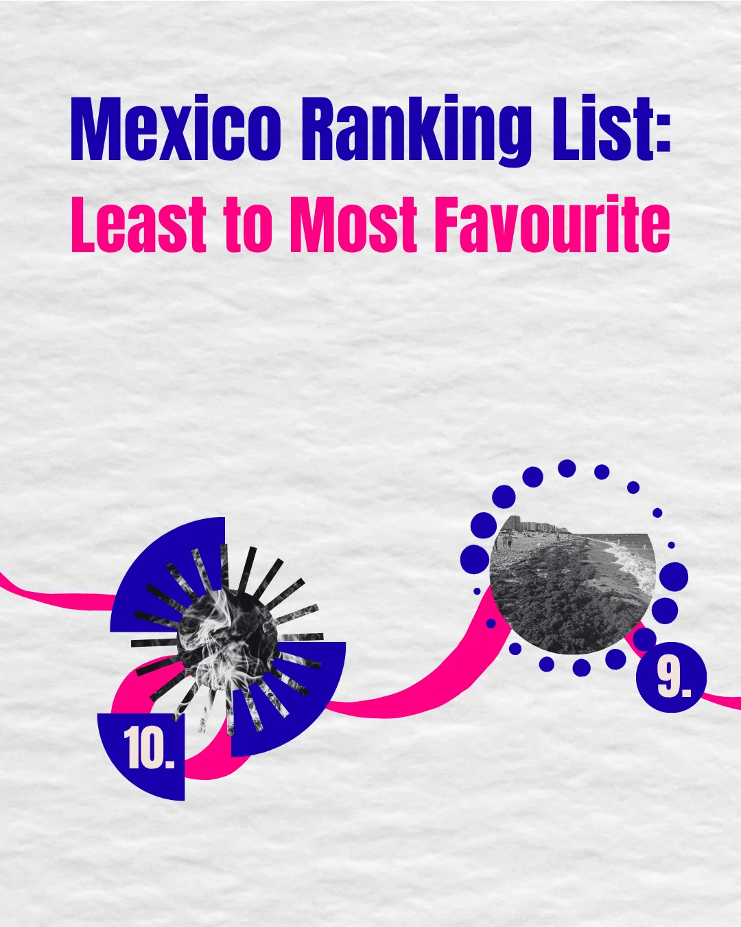
When addressing consumer habits, encouraging followers to rethink familiar booking platforms, the design needed to deliver a subtle critique without sounding aggressive.
The Execution:
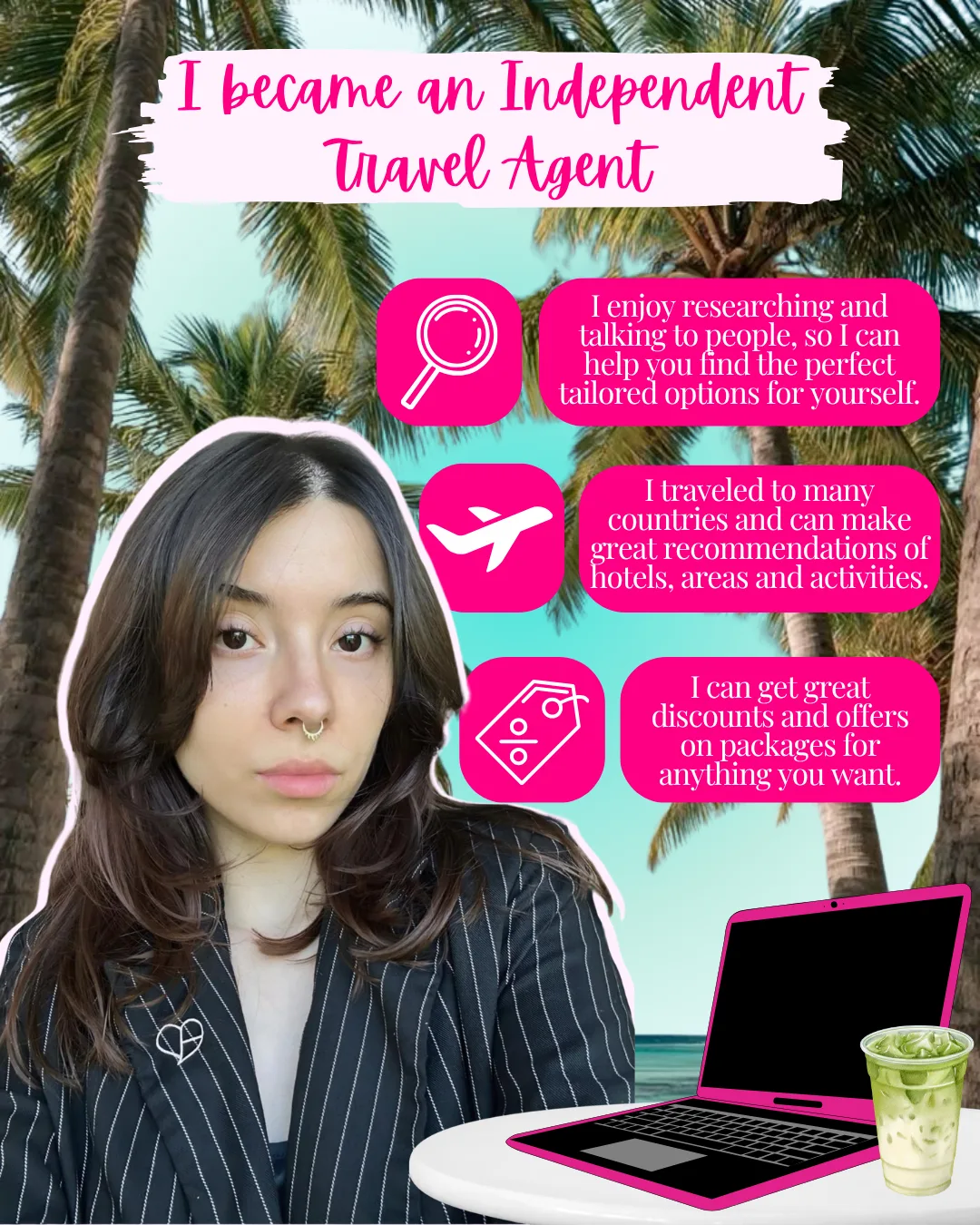
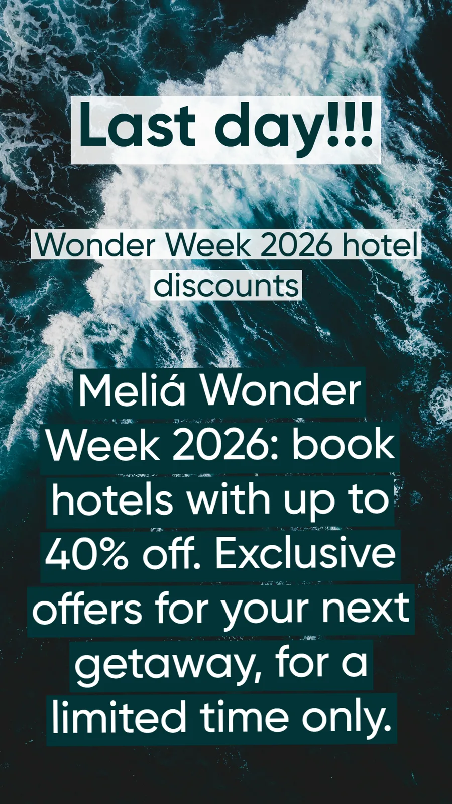
An initial scrapbook concept was refined into a streamlined design pairing Gen Z design motifs with soft nature imagery. By balancing playful visual metaphors with clear messaging, complex or introspective topics were rendered lighthearted, accessible, and high-converting.
Campaign Execution & Collateral:
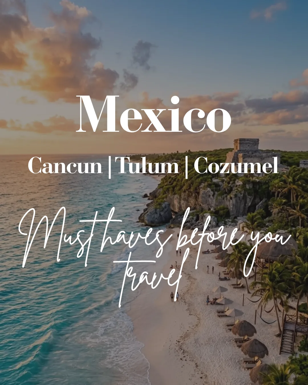
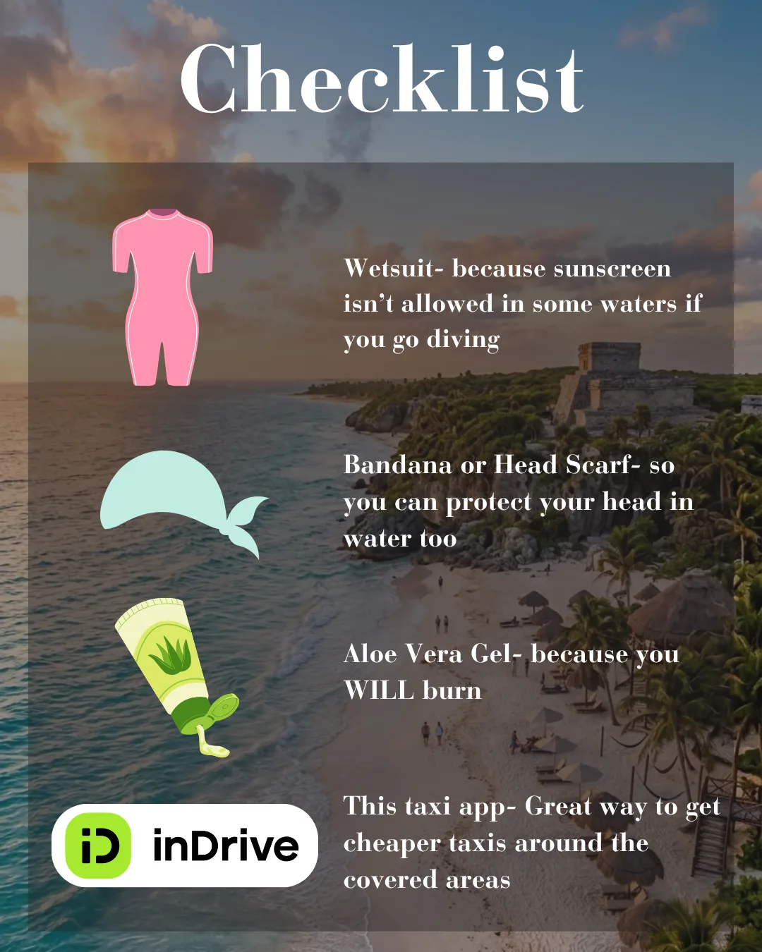
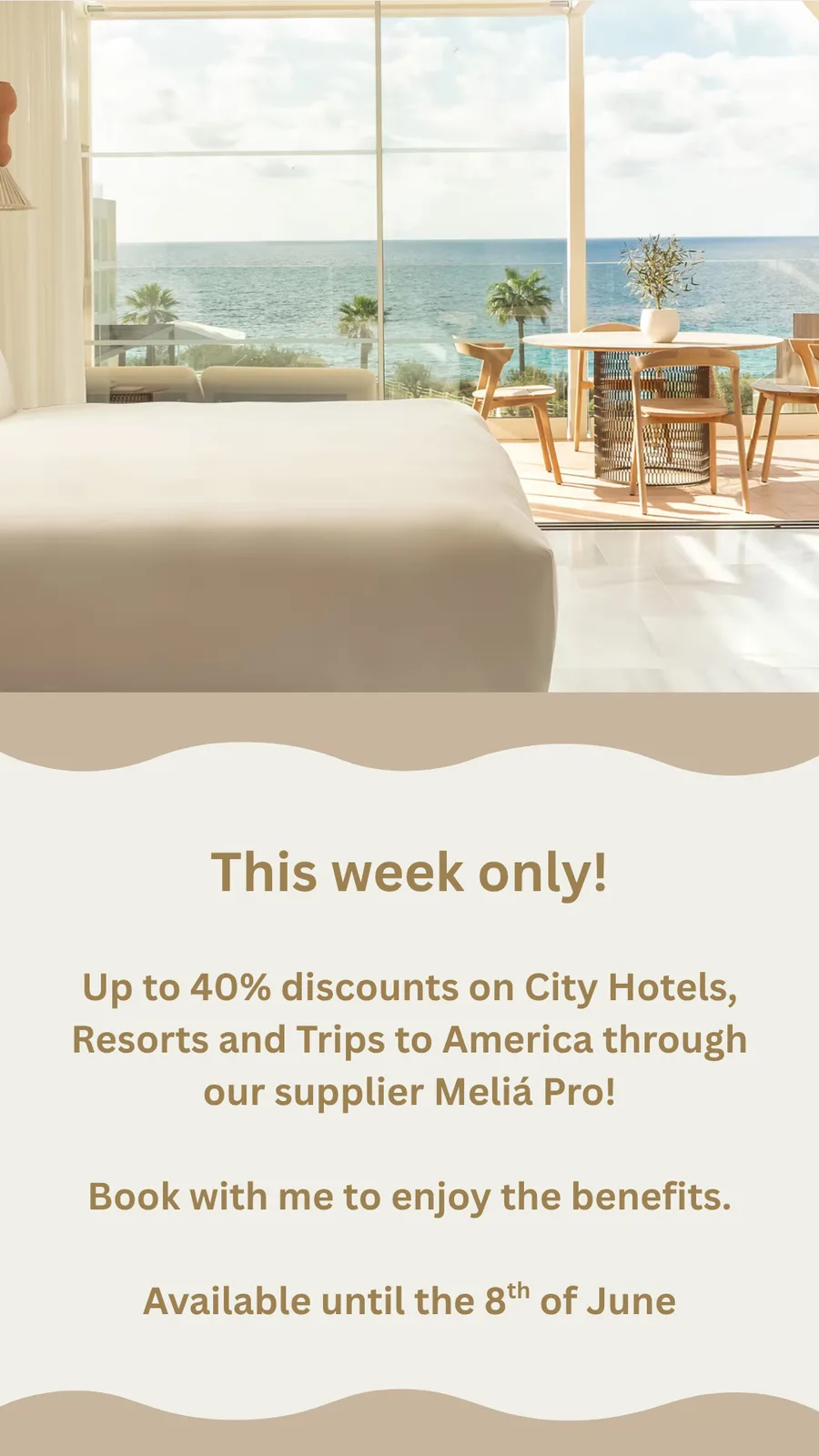
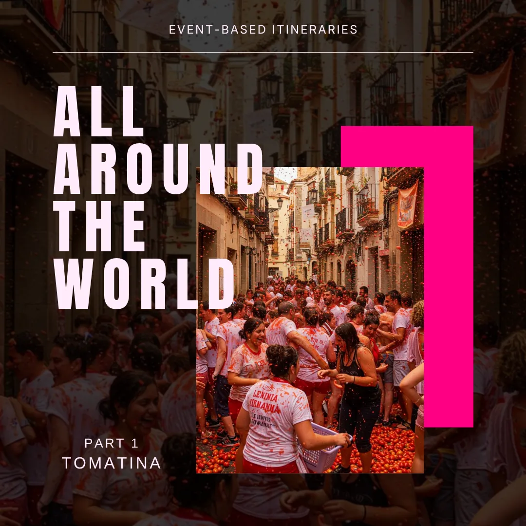
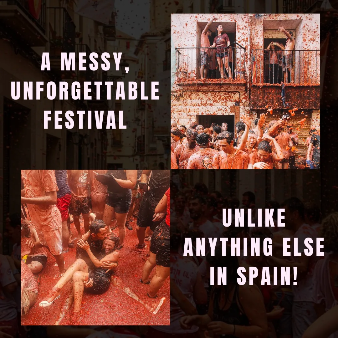
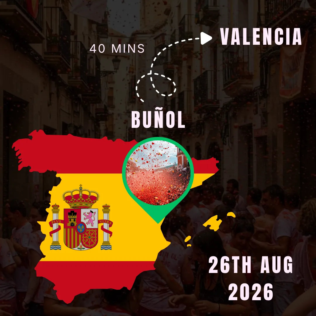
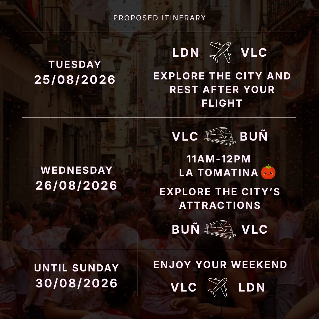
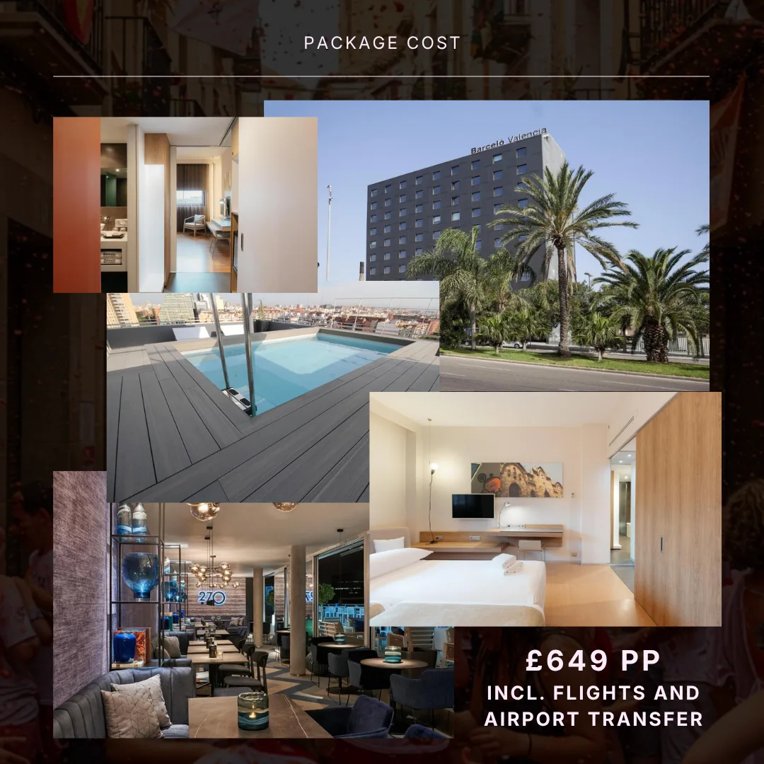
The scrapbook collage style was ultimately repurposed for informational guide slides and carousel posts, proving its versatility across different content pillars: - Interactive Carousels: Designed multi-slide posts using layered elements, custom cut-outs, and deliberate typography hierarchies to keep viewers swiping. - Brand Consistency: Maintained a signature "glamorous girl holiday" aesthetic across personal introduction posts, destination breakdowns, and educational guides.
Strategic Takeaway:
This ongoing project highlights the power of visual tone in content marketing. Design choices, from color palette selection to collage layering, can completely shift how an audience receives a message, making brand messaging feel like an inviting conversation rather than a sales pitch. It serves as a testing ground for refining graphic design principles, asset composition, and visual storytelling tools.