← Projects
Selected Client — 2026

Creative Direction Project - Vogue x Fiona Rae

A creative direction project developed with the support of Vogue College lecturers, showcasing a jewellery supplement concept for Fiona Rae through campaign imagery, cover design and launch invitation work.

Creative Direction · Art Direction · Editorial Concept · Campaign Design

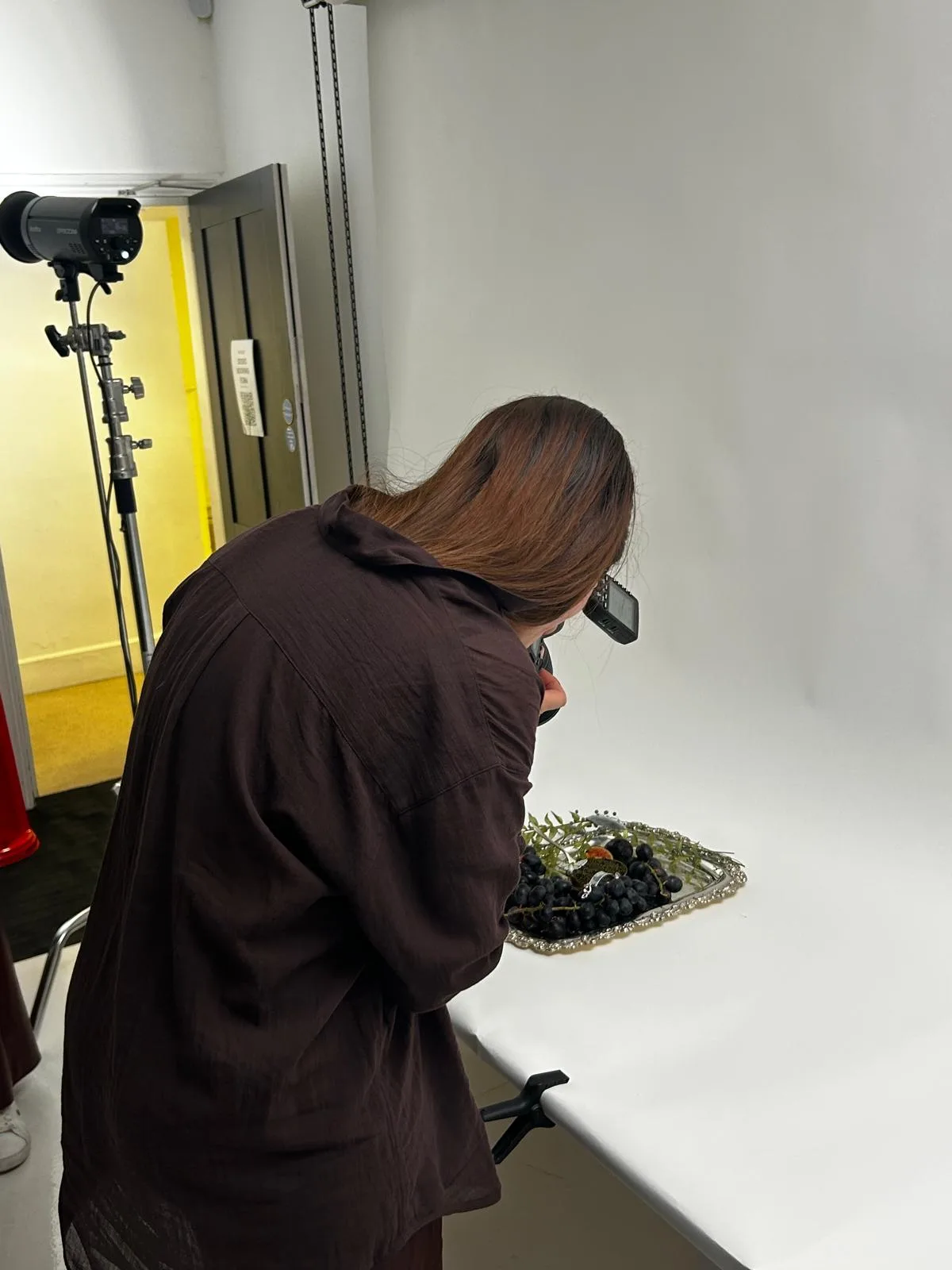
In June 2026 I had the honour and amazing opportunity of studying Creative Direction with lecturers from Vogue and developing my skills and ideas. During the 5 days spent at the college, we had to work collaboratively towards creating a creative concept, then executing it and presenting it to the stakeholders.

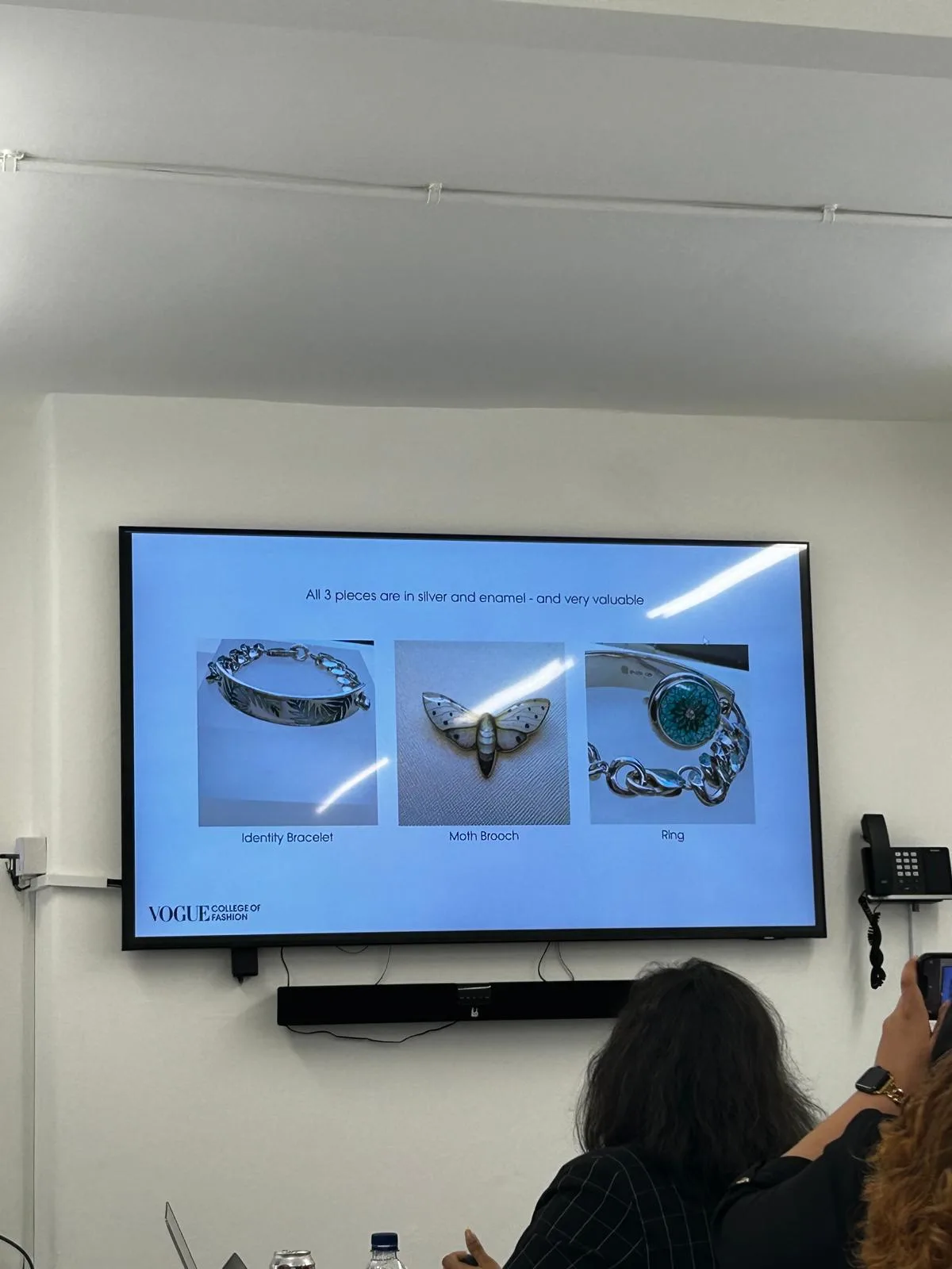
The brief requested a jewellery supplement to showcase three beautiful pieces made by Fiona Rae, which would blend her brand’s vision with the Vogue editorial style.

Fiona Rae’s pieces
Fiona Rae’s pieces

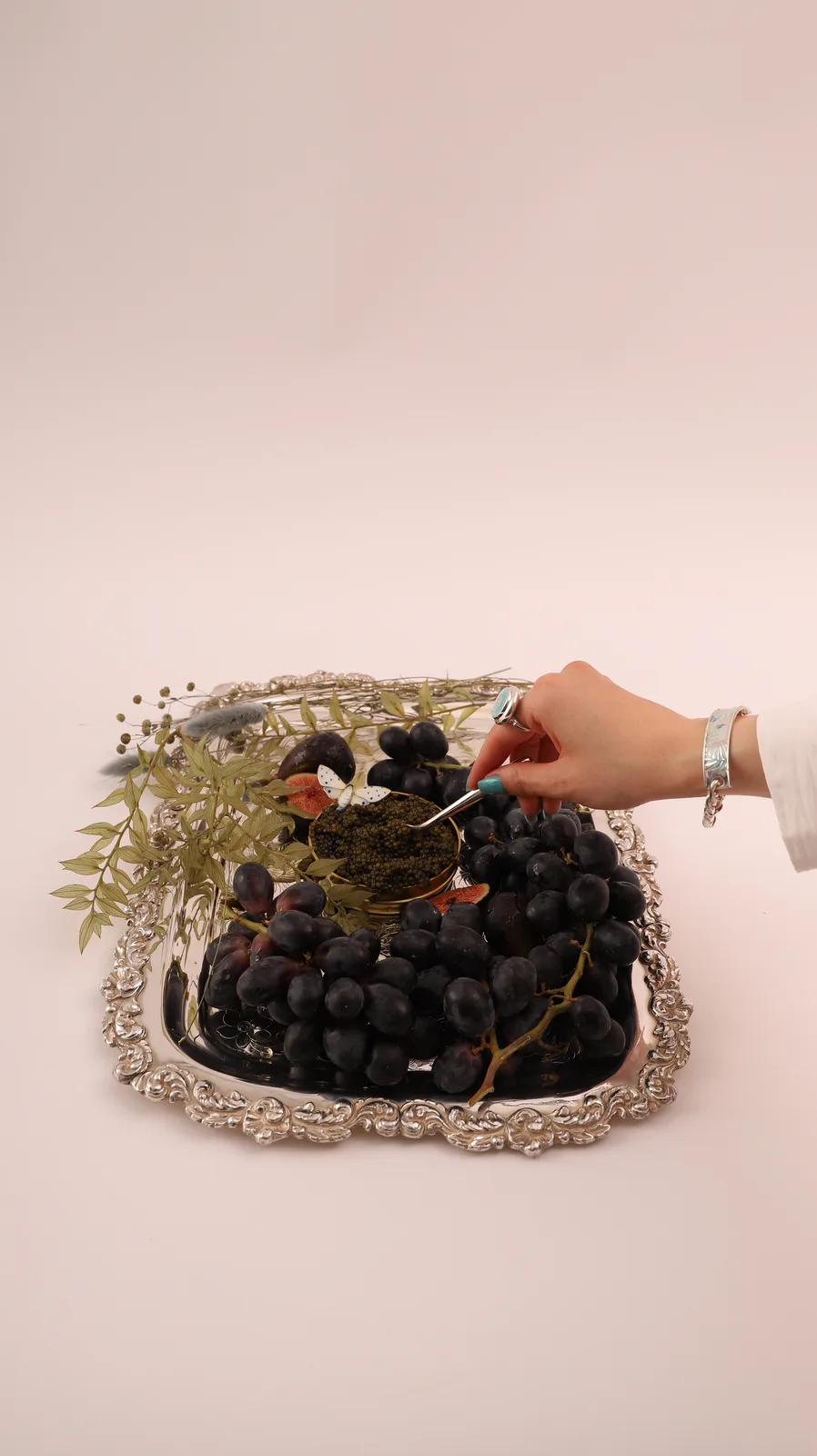
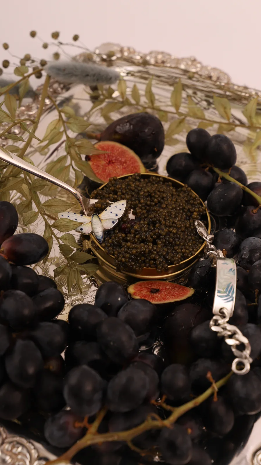
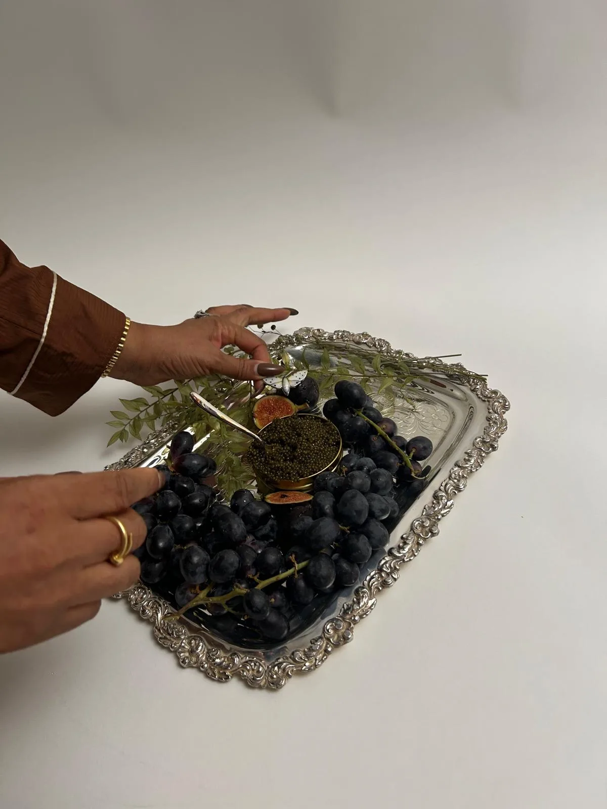
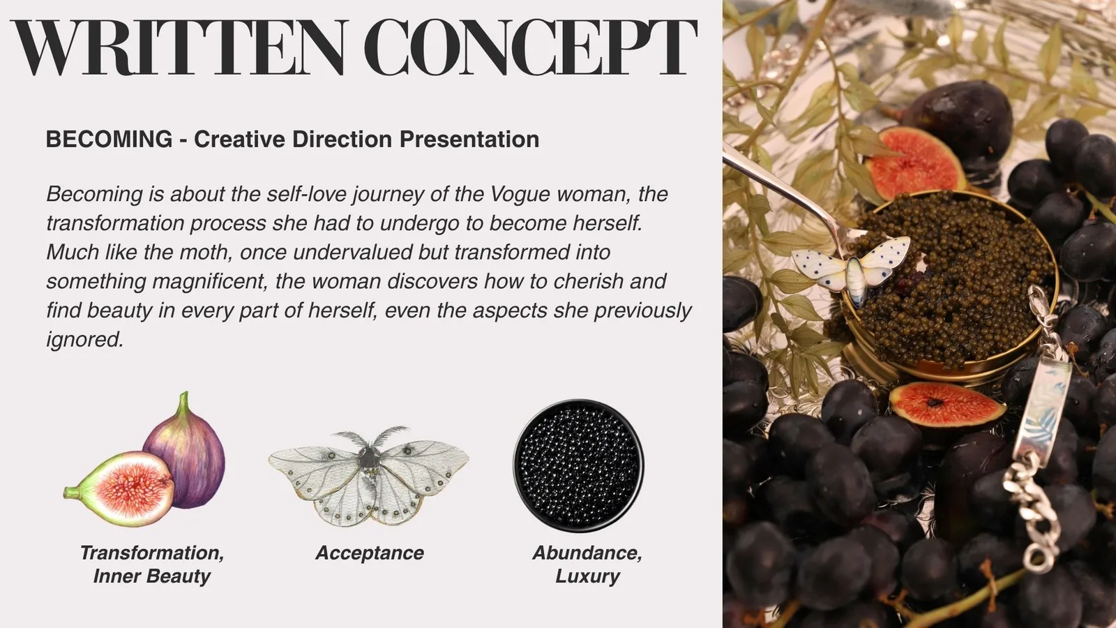
The initial idea I came up with was showcasing the 3 pieces in a photoshoot suggesting opulence and abundance, placing them on a silver platter alongside figs, grapes, caviar and decorative plants. I developed the concept having the young Vogue woman in mind, the woman who didn’t grow up with much, reading Vogue and dreaming of luxury. Now, she’s matured, she’s more confident, she found her path. She is finally being able to afford the lifestyle she’s always hoped for. The main motif was the caviar, a timeless symbol for success, wealth and indulgence.

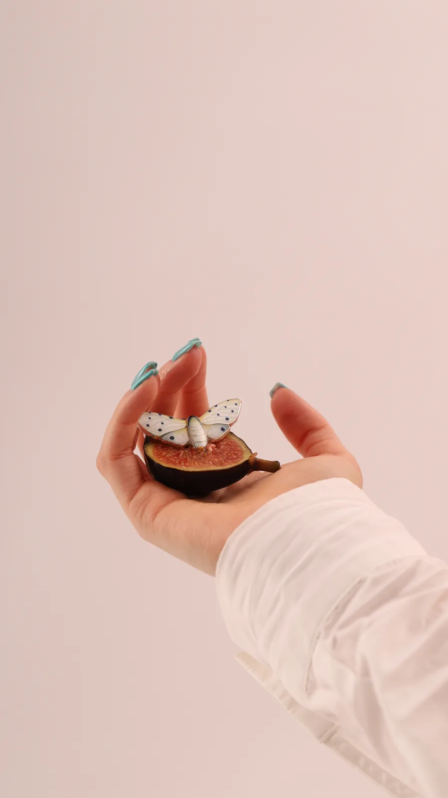
However, after shooting day, we liked another photo much more than the one we’ve started with. It had much more of the Vogue brand embedded in it.

Photoshoot Results Photoshoot Results
Photoshoot Results

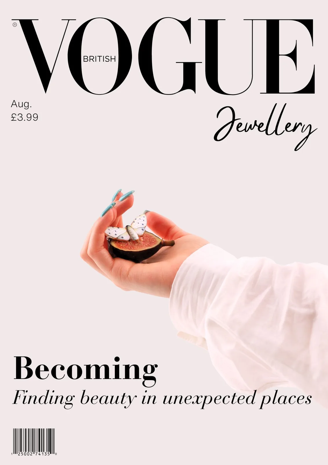
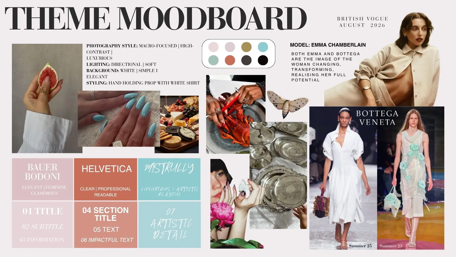
The photo on the left was initially going to be our cover, but we decided to go for the second one. The challenge was now that the entire mood board, fashion brand, model and typography were not aligning with the initial concept anymore. I came up with the idea of keeping the core of the idea, but changed the nuance. The new story was not about wealth and abundance anymore, but about the transformative journey undergone by young women. In a society that promoted prioritising preserving yourself over becoming yourself, our concept wanted to remind women of the beauty of changing. Much like the transformation from larvae to moth, the journey is painful, challenging and messy, but necessary. The young woman grows into her true self and learns to love parts of herself that she’s rejected before. The brooch showing a moth turned into a magnificent piece highlights the importance of finding beauty in unexpected places.

Creative Direction Project - Vogue x Fiona Rae Creative Direction Project - Vogue x Fiona Rae Creative Direction Project - Vogue x Fiona Rae
Creative Campaign Execution Creative Campaign Execution
Creative Campaign Execution

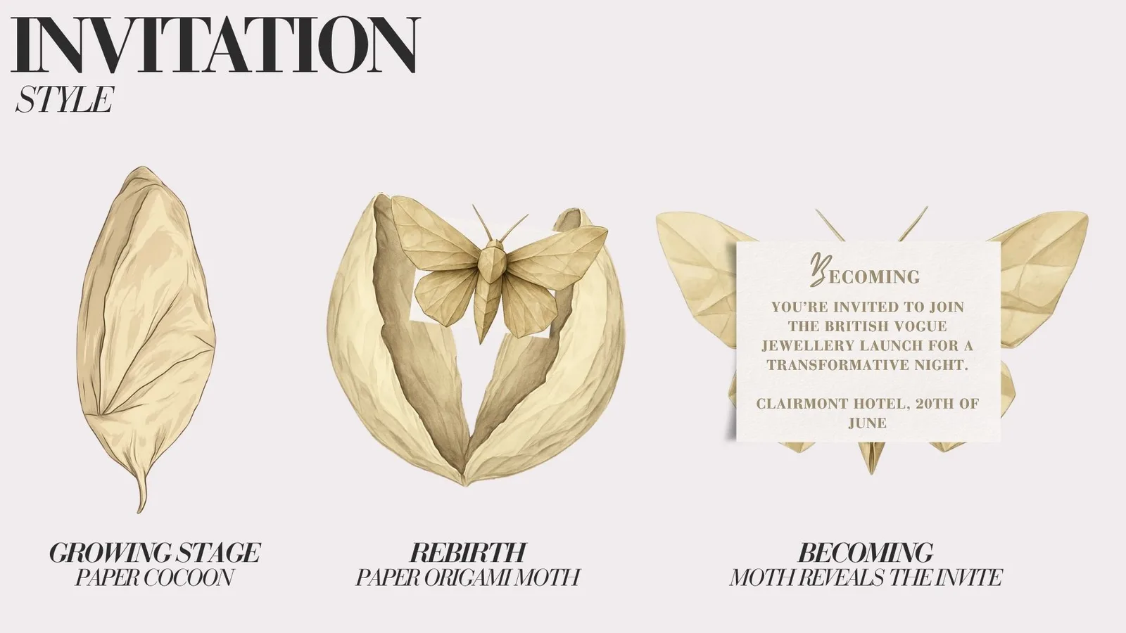
I have also designed the invitation to the launch, which was another part of the assignment. I wanted to reinforce the theme of the campaign by comparing the evolution of the young woman to that of the moth opening its wings and escaping its cocoon. I imagined them made out of paper origami, which would be sustainable and achievable in a real scenario. I’ve decided to use neutral colours and keep the execution very simple: the concept speaks loud through its messaging, not needing to rely on extravagant details.

The final result for the cover page was powerful through its simplicity and metaphor and we all felt that it spoke for Fiona’s jewellery and Vogue at the same time.

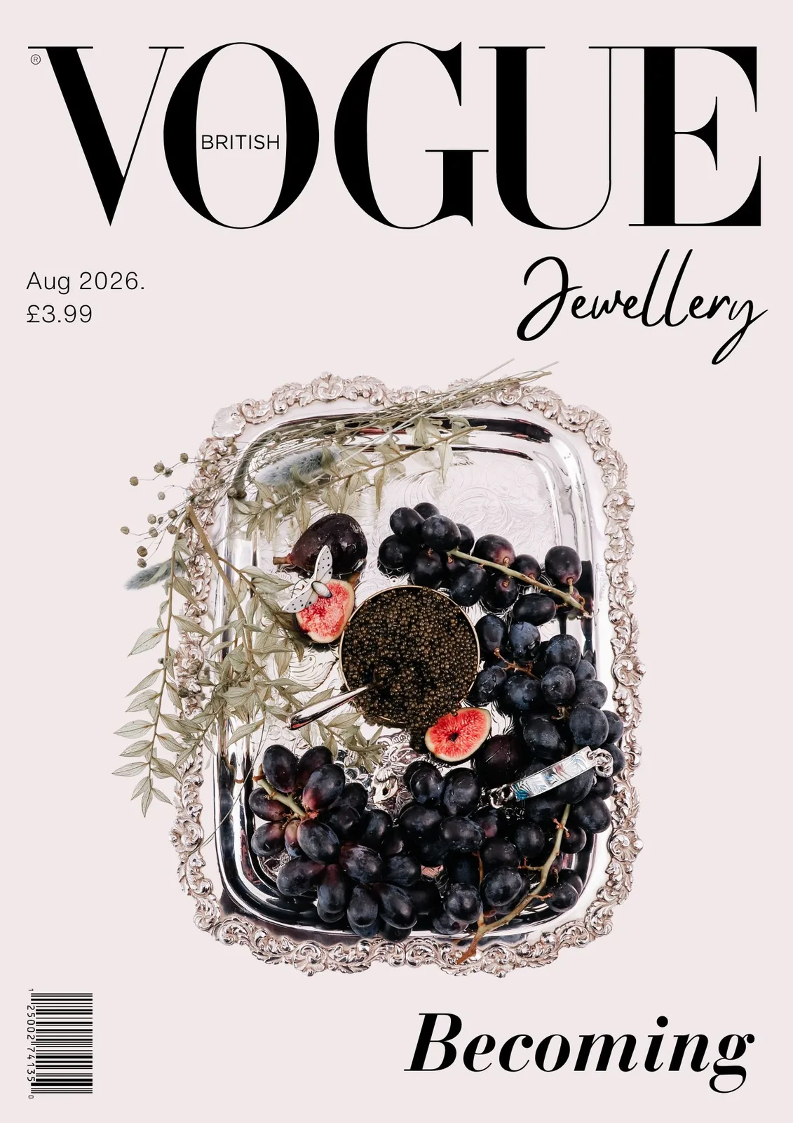
Cover Page Options Cover Page Options
Cover Page Options

We presented to Fiona two options, as we enjoyed the aesthetics of the second one too, however the main one which made it to the presentation has been the first.

I enjoyed working on this project as it taught me valuable lessons about visual materials and production, but more importantly because it taught me how to link every creative choice to the theme, keeping it consistent and meaningful. I believe in this concept as it’s culturally relevant and commercially powerful. It addresses a reality that many women live, sparking strong emotions and opinions, an issue that won’t become irrelevant in today’s society anytime soon. Additionally, it creates this persona that customers would admire and desire - the wealthy woman who is looking for more than beauty in the pieces she wears. She wants them to be powerful, meaningful, and send a strong message. This message would be that her wealth is worked for, deserved, built alongside her personal transformative journey. She is wearing the moth proudly as a symbol of the pain of becoming herself, of the beauty that she held which society labeled as ugliness.

I have discovered through this campaign how much I get inspired by finding higher meaning behind every concept and trying to understand how it can appeal to emotion and life experience. Beauty campaigns don’t need to attract customers by making them insecure, convincing them to desire a made-up ideal. They can be convincing by being self-aware, showcasing realities that matter, that we often disregard, turning the pieces into a symbol of self-actualisation.

← Back to Projects